
[box]R and RStudio Installation Instructions can be found here.[/box]
[box]Introduction slides can be found here.[/box]
Introduction
In this exercise we will be going through some very introductory steps for using R effectively. We will read in, manipulate, analyze and export data. We will be using RStudio which is a user friendly graphical interface to R. Please be aware that R has an extremely diverse developer ecosystem and is a very function rich tool. The steps used to complete each step of this exercise can be completed in a variety of ways. The steps shown here just demonstrate one possible solution.
Important to remember! You can get help with any R function while in R! This can be done by typing a ? ahead of the command:
?read.table
Additionally, the internet has a large number of useful resources:
- The R Project Homepage: http://www.r-project.org
- Quick R Homepage: http://www.statmethods.net
- Bioconductor: http://www.bioconductor.org
- An Introduction to R (long!): http://cran.r-project.org/doc/manuals/R-intro.html
- Google – there are tons of tutorials, guides, demos, packages and more
In this exercise we will be looking at and analyzing data in a “data frame”. A data frame is basically R’s table format. The data frame we will be using is viral abundance in the stool of healthy or sick individuals.
The context of the data is not important for completing the exercise. The goal of this exercise is to familiarize you with working with data in R, so the lessons learned working with this data set should be extendable to a variety of uses.
Getting data into R
Download the following two data sets. Remember the location of the folder where you put the files:
You should first set your working directory (setwd) to the location of the example files you just downloaded. For example:
setwd("~/Desktop/scott/R_data/")
Then you should use the read.table function to read this file into RStudio.
[box]Remember, you can get detailed information and examples for any R function by preceding the ?. For example, ?read.table.[/box]For simplicity, we will just rename our data tables “healthy” and “sick”:
healthy <- read.table("myoviridae_healthy.txt")
sick <- read.table("myoviridae_sick.txt")
Note that when a file outside of R is referenced it must appear in quotes. Go ahead and take a look at the data frame by simply typing healthy and then sick.
You should see the full data tables spill out on the screen. Since this data table is large it will be difficult to look at in its entirety, fortunately we can use some basic commands to view small slices of the full data table. You can slice data using the following convention:
data_file[rows,columns]
The rows and columns can be separated by a : to describe a range. For example, if we just wanted to look at the first 3 rows of a our data file we would type:
healthy[1:3,]
To look at the first three columns we would type:
sick[,1:3]
Note the importance of the placement of the comma for selecting either rows or columns of data.
You can also use the head command (type ?head to get an idea of what it does) to display the top portion of our data table.
Activity
Exercise 1: Look at the first few rows of the bac data table using the head function:
You should spend some time slicing the data table up in various ways.
You can specify a column of data using the $ before the column name. Try defining the Tevenvirinae column using $Tevenvirinae on the sick data frame you just imported.
[toggle hide=”yes” border=”yes” style=”white”]
You should become comfortable with defining subsets of the data table before moving forward. Please spend some time defining various subsets of the data table and observing the output.
Exercise 2: Creating new data tables from pre-existing data tables.
You can create new data tables with subsets of the original data table. You do this by assigning a subset of data using <-. The basic convention for creating a new data table (or any other data structure) is:
new_file <- data.frame(old_file(functions))
For example, create a new data table with just Tevenvirinae. For simplicity, just use the *_tev so you won’t have to type Tevenvirinae any more. Remember, tab-completion is supported in RStudio!
healthy_tev <- data.frame(healthy$Tevenvirinae)
sick_tev <- data.frame(sick$Tevenvirinae)
Exercise 3: Data frame transformations
To complete this exercise you will need to become familiar with: 1) the concept of margins and 2) how to install packages from the R archive.
Margins are simply the way in which R defines columns or rows. Put simply, margin=1 directs R to do something along a column of data, while margin=2 tells R to do something along a row of data.

Packages can be installed from command input, or via searching/installing in RStudio. Packages are typically stored in the Comprehensive R Archive Network or CRAN, but they can also be pulled from GitHub or loaded manually.
For this exercise we will install the vegan package from CRAN archive. Vegan is a well-developed community ecology package for R which implements a number of ordination methods and diversity analysis on ecological data.
To install a package on the R command line you use the following syntax:
install.packages(“package_name”)
So to install vegan type:
install.packages(“vegan”)
You then need to load that package into your R session using the library command:
library(“vegan”)
While there are many native R functions for transforming data we will take advantage of the decostand functions of vegan to do some common ecological data transformations. You can read more about decostand and view some examples by typing ?decostand.
Let’s start by transforming our healthy and sick data frames using the total method of decostand. The basic syntax for this is below. The transformation method can be substituted, and you should name your file something memorable such as healthy_total:
new_file_name <- decostand(data.frame, method="total")
healthy_total <- decostand(healthy, method="total")
Do the same thing for the sick data frame.
Repeat this procedure for the healthy and sick data frames, but instead of using total normalization use Hellinger normalization.
[toggle hide=”yes” border=”yes” style=”white”]healthy_hellinger <- decostand(healthy, method="hellinger")
sick_hellinger <- decostand(sick, method=”hellinger”)
[/toggle]At the end of this exercise you should end up with four new files. Two should be total normalized for both healthy and sick, and two for Hellinger normalized for both healthy and sick.
If you accidentally made a data frame that you no longer want, it can be removed using the rm command. For example rm(file) will remove the data frame named file. Your environment should look more-or-less like the picture below.

You should now be comfortable with:
- The concept of margins
- How to install packages from the CRAN Archive
- How to apply commonly used ecological data transformations to a data frame using the decostand package
- How to remove data using the rm command
If you do not understand these basic concepts go back and review as they will be important for moving forward.
Exercise 4: Use the summary function on descriptive data to quickly quantify each type of sample in the data table.
The summary function is quite useful and a great tool that does precisely what it sounds like. It summarizes the given data and provides basic metrics and statistics. This can be very useful for generating quick overviews of factorial data which in many studies takes the form of metadata tables.
Download the following files to your working directory and import them into RStudio:
[toggle hide=”yes” border=”yes” style=”white”]healthy_metadata <- read.table(“healthy_metadata.txt”)
sick_metadata <- read.table(“sick_metadata.txt”)
[/toggle]Run the summary function on each newly imported data frame to get a quick overview of the metadata associated with this study.
[toggle hide=”yes” border=”yes” style=”white”]


[/toggle]
You can also produce summary data for all of the data in the healthy and sick data frames. If you do this you will get a lot of information that will pour through the screen. Go ahead and try it out.
Exercise 5: Basic plotting.
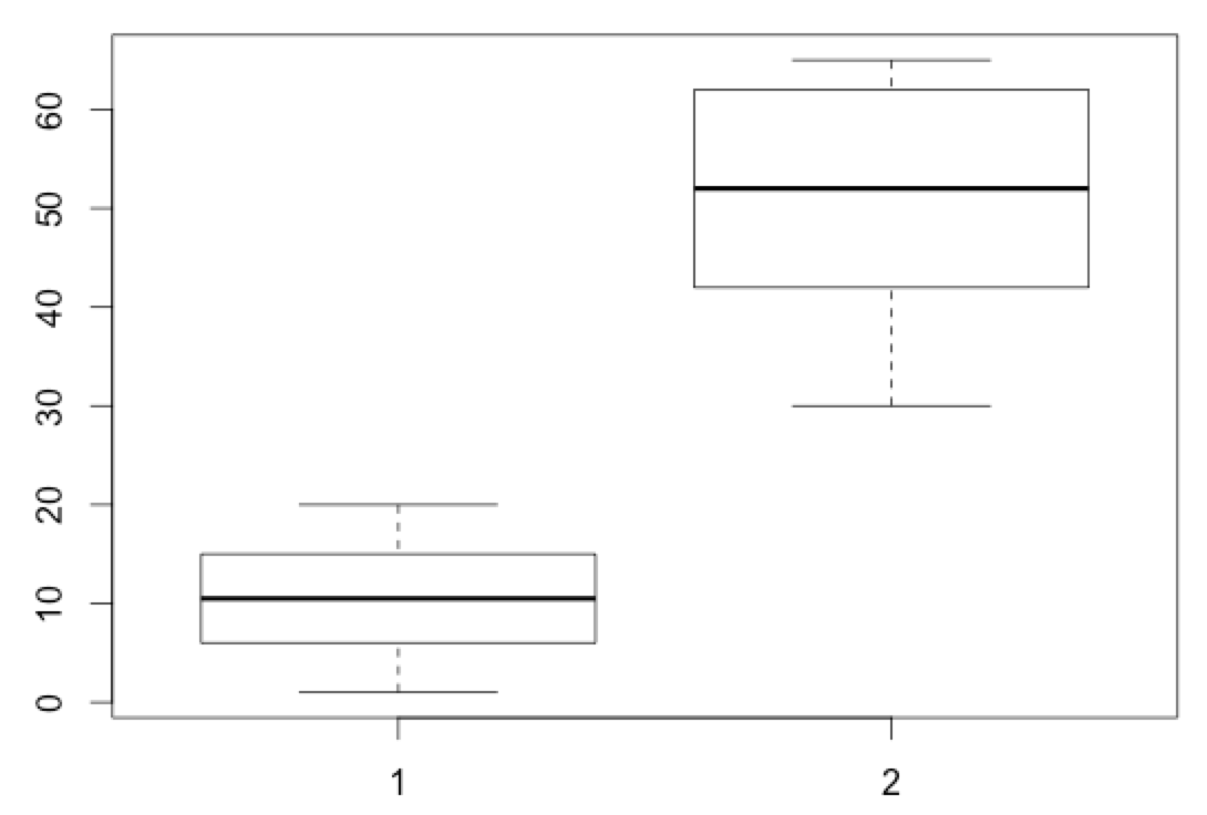
Boxplots in R use the conventions detailed in the figure below and are useful for describing the variance in a set of numerical data.

Let’s make a boxplot comparing the age’s in our healthy and sick metadata data frames. Using the boxplot function, attempt to make the figure below. Try to do this before revealing the solution building on what you learned from above.
[toggle hide=”yes” border=”yes” style=”white”]
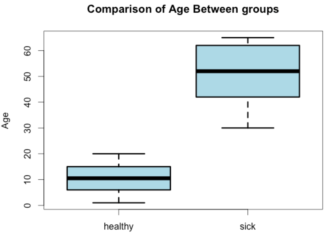
boxplot(healthy_metadata$Age, sick_metadata$Age)
[/toggle]Notice how this boxplot doesn’t have a lot of titles or other information. Let’s do some manipulations to this graph to try and make it a little more informative.
Read through the boxplot options using ?boxplot and try to recreate something that approximates the graph below. Try to see how far you can get before looking at the hidden answer and don’t worry if you can’t get the color or line width exactly as it is in this figure. If this is your first time using R it is unlikely you will know all of the commands to completely reproduce this graph, but give it a try.
[toggle hide=”yes” border=”yes” style=”white”]
boxplot(healthy_metadata$Age, sick_metadata$Age, col=”light blue”, names=c(“healthy”, “sick”), lwd=3, main=”Comparison of Age Between Groups”, ylab=”Age”)
[/toggle]An explanation of each of these modifiers is below:
– main adds a main title to the plot
– ylab adds a y-axis label
– names: adds “healthy” and “sick” labels to the x-axis. This one is a bit tricky and you have to use the names function in box plots. Use the ?boxplot help page for assistance and remember that text strings should be enclosed in quotes. This is basically how you label the x-axis
– col: adds color to the box plot, in this case we used light blue
– lwd: increased the width of the boxplot lines from the default of 1 to 3
Exercise 6: Defining layouts.
R has powerful graphical layout tools. These layout options allow you to plot several graphs next to one another in a very controlled manner. There are a variety of ways to define these layouts, but the simplest and most frequently used way is to define the layout paramaters using the par function.
For example, the following command will define a 2×2 layout for graphing:
>par(mfrow=c(2,2))

While this would define a single row with three columns (1×3)
>par(mfrow=c(1,3))

These settings are maintained by R until you change them. To get back to the default layout you can simply enter:
>par(mfrow=c(1,1))
Define a 1×3 layout and make 3 boxplots comparing the abundances of Tevenvirinae, PhiCD119likevirus and Clostridium_phage_c.st between healthy and sick individuals.
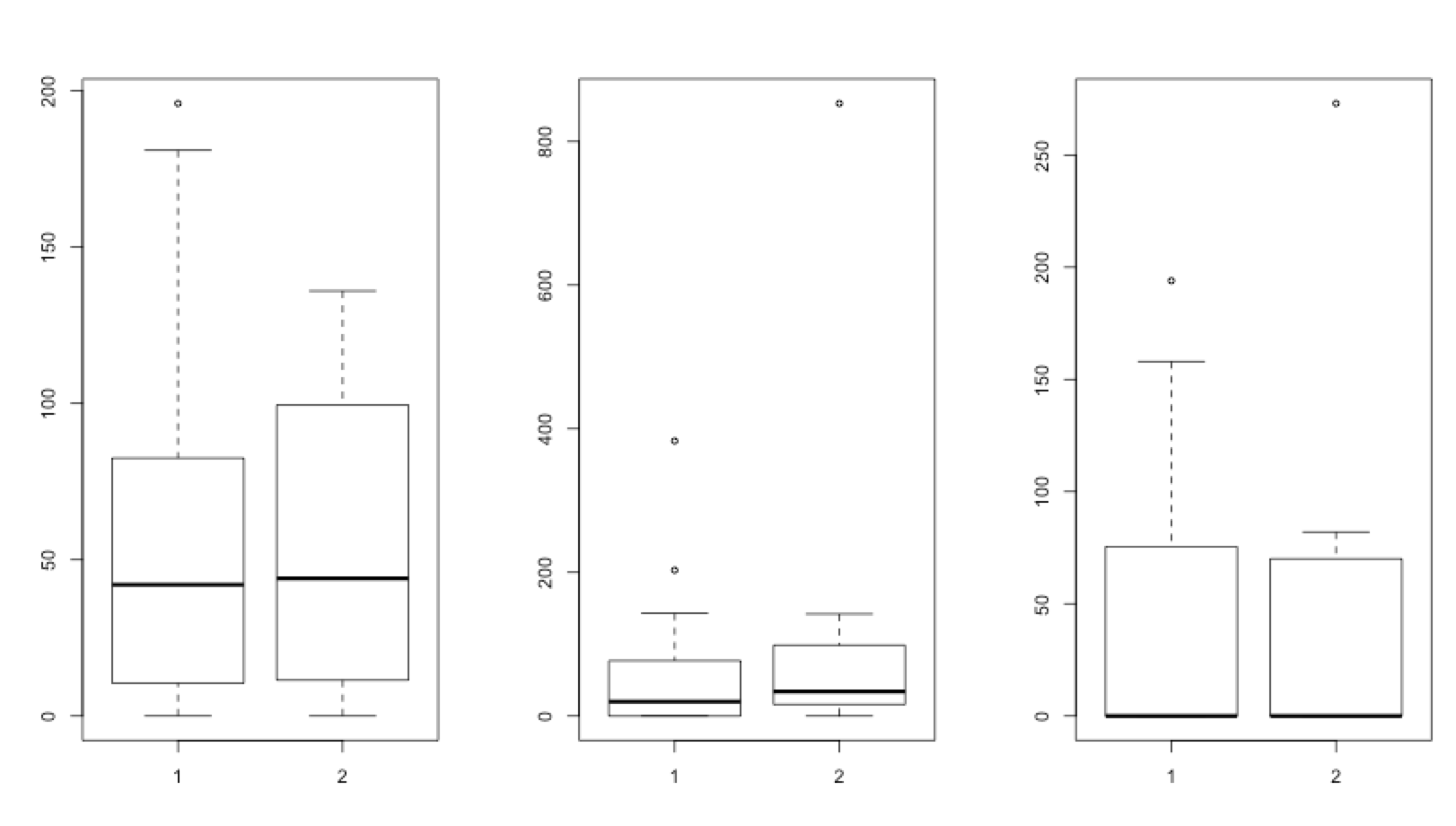
boxplot(healthy$Tevenvirinae, sick$Tevenvirinae)
boxplot(healthy$PhiCD119likevirus, sick$PhiCD119likevirus)
boxplot(healthy$Clostridium_phage_c.st, sick$Clostridium_phage_c.st)
Now attempt to draw the same plot, but use the Hellinger normalized data you generated previously.
[toggle hide=”yes” border=”yes” style=”white”]boxplot(healthy_hellinger$Tevenvirinae, sick_hellinger$Tevenvirinae)
boxplot(healthy_hellinger$PhiCD119likevirus, sick_hellinger$PhiCD119likevirus)
boxplot(healthy_hellinger$Clostridium_phage_c.st, sick_hellinger$Clostridium_phage_c.st)
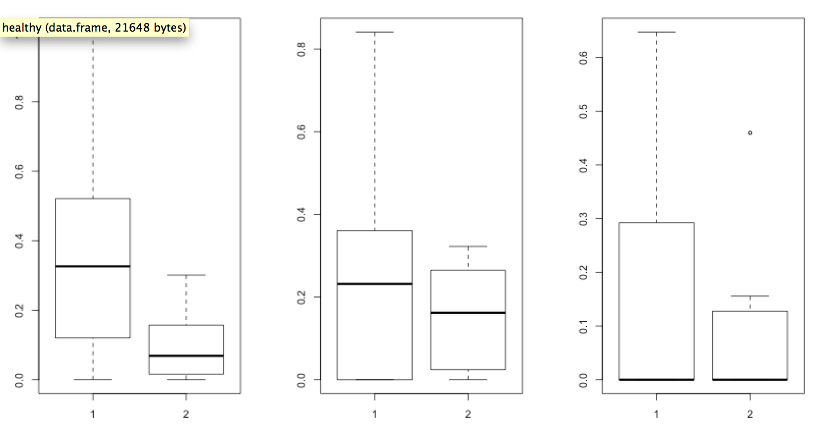
You can immediately see the impact that Hellinger normalization had on the sample data. However, the graph is still difficult to interpret. Try to use the skills you obtained from previous Exercises to put together a graph similar to the one below.

[toggle hide=”yes” border=”yes” style=”white”]
par(mfrow=c(1,3))
boxplot(healthy_hellinger$Tevenvirinae, sick_hellinger$Tevenvirinae, ylim=c(0,1), col=”salmon”, lwd=2, names=c(“Healthy”, “Sick”), main=”Tevenvirinae”)
boxplot(healthy_hellinger$PhiCD119likevirus, sick_hellinger$PhiCD119likevirus, ylim=c(0,1), col=”yellow”, lwd=2, names=c(“Healthy”, “Sick”), main=”PhiCD119likevirus”)
boxplot(healthy_hellinger$Clostridium_phage_c.st, sick_hellinger$Clostridium_phage_c.st, ylim=c(0,1), col=”steel blue”, lwd=2, names=c(“Healthy”, “Sick”), main=”Clostridium_phage_c.st”)
par(mfrow=c(1,1))
[/toggle]Exercise 5: More with packages and drawing heatmaps
In this exercise we will install and work with a library designed to produce high-quality heatmaps.
To install this package, you can either use the Packages tab in the lower-right window of RStudio and searching for pheatmap. Or simply type:
>install.packages(“pheatmap”)
Once the program has successfully you will need to activate it:
>library(“pheatmap”)
Once installed you should review its documentation with ?pheatmap.
Heatmap visualization can benefit from data normalization to diminish the challenges associated with discerning differences between very large and small values. There are a number of ways to normalize data (log, sqrt, chi-sqaure transform amongst others). For this exercise we will continue to use the Hellinger normalized data used in previous exercises.
Taking guidance from the pheatmap help file attempt to generate the heatmap shown below. In order to do so you will need to adjust the following:


[toggle hide=”yes” border=”yes” style=”white”]
pheatmap(healthy_hellinger, cluster_cols=FALSE, cellwidth=8, cellheight=8, main=”Healthy”)
pheatmap(sick_hellinger, cluster_cols=FALSE, cellwidth=8, cellheight=8, main=”Sick”)
[/toggle][box]Of note, pheatmap doesn’t utilize the par functions like boxplot does in the previous examples. You will get one heatmap per page and need to move forward and backward to see both plots.[/box]
Exercise 7: Exporting Data
Tabular data can be exported using the write.table function in R. You can also specify the deliminator.
To export your newly normalized bac_sqrt file to analyze in another program requiring a tab-deliminated file type, you would simply type:
write.table(healthy_hellinger, file=”healthy_hellinger.txt”, sep=”\t”)
If you would like to export to Excel format you can do so using the xlsReadWrite library.
Exporting plots in RStudio is accomplished using the Export tab in the plot window. A variety of formats and sizing options are available.
Exercise 8: Using R Markdown as a shareable analysis notebook.
RMarkdown is a powerful tool for keeping track of and sharing your workflows.
You can create a new RMarkdown document in RStudio by selecting File -> New File -> R Markdown …
You will be presented with the window below. Give your document a title and author and select HTML for now. However, output to PDF and Word are also useful options.

Once you launch a new document you will be presented with a basic framework with a few examples to help get you started. These examples are useful for your first document, but can be safely removed.
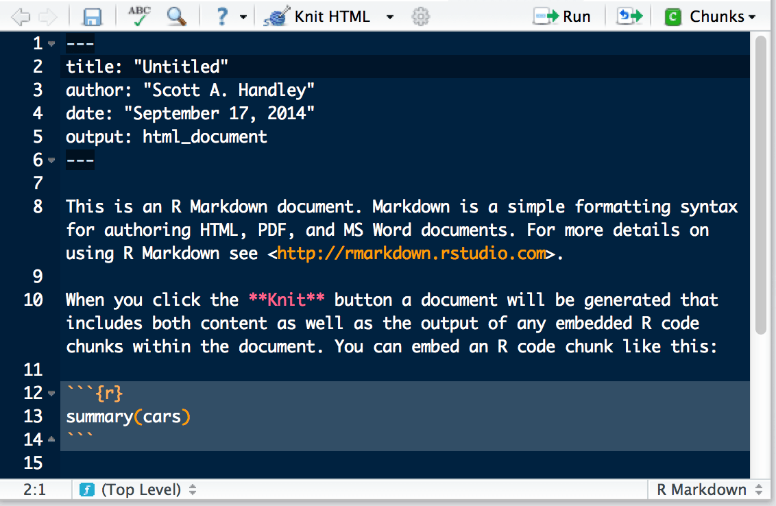
RMarkdown has extensive functionality, but the basic idea is that you can embed your R commands with “`{r} “` to make it reusable and launchable. For example, in the screenshot above, the R command summary(cars) is the format you should follow with your own R commands.
For a basic example, embed the code used to draw the colorful boxplots above into the RMarkdown document. You can just copy and paste it from this website above, or from your own code. Ultimately it should look somewhat like the screenshot below:
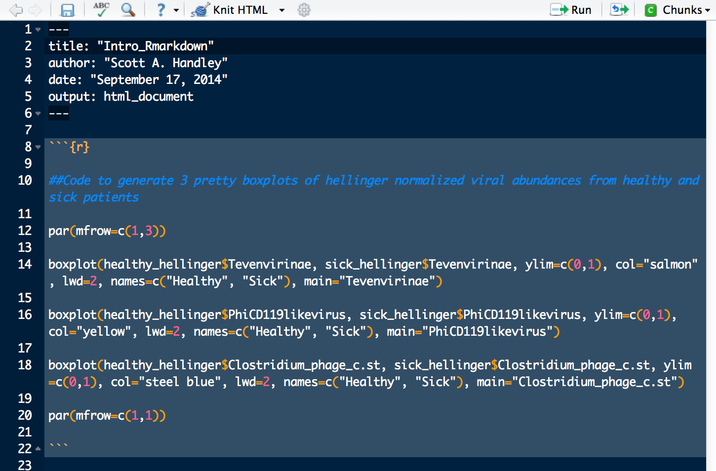
Everything between the “`{r} and the closing “` is called a “chunk”. Chunks are just code-blocks that can be quickly modified and launched.
Make sure your current chunk is highlighted in the RMarkdown document and use the Chunks dropdown menu to select Run Current Chunk.
Your code chunk should be implemented in the console window and you should get the completed graph in the plot window.
The file below is the full RMarkdown document for this exercise (without some of the intermediate steps). You can download it, load it into RStudio and launch the entire series of commands or each chunk individually.
KNITR enables the generation of dynamic reports from RMarkdown documents. Once you are satisfied with your RMarkdown file you can click the KNIT Html button. This will initiate RMarkdown document knitting, which basically converts your RMarkdown code into HTML. PDF and Word are other options.
You can see the HTML output from this RMarkdown introduction here:
Knitted RMarkdown Introduction
The combination of RMarkdown with KNITR report generation creates a workflow for shareable, repeatable analysis.