
Activity on PCA and MDS
Activity by Anders Albrechtsen, 25 January 2018
Overview of exercises by Anders here .
Small intro with known genotypes
PCA/MDS for real data
admixture aware priors without estimate admixture proportions
Small intro with known genotypes
First let’s input the genotype into R. Open Rstudio with your preferred browser (typing “[HereYourIP]:8787”).
## open R
## set your working directory, e.g. setwd("~/")
G <-matrix(c(1,0,2,0,2,0,2,1,1,1,0,1,0,2,1,2,1,1,1,1,1,0,1,0,2,0,1,1,0,2,1,2,0,1,0),5,by=T)
nInd <- nrow(G)

print(G)
## don't close R
- Identify the rows and the columns. Does each row contain the genotypes of a site or an individual? And what about each column?
Let’s try to do MDS. First let’s calculate the distance. The simple distance measure as seen in the slides is called a Manhattan distance.
## continue in R
D<-dist(G,upper=T,diag=T,method="manha")
D
## don't close R
- How many dimensions are used to represent the distances?
Then reduce the dimension to 2 dimensions using MDS and plot the results:
 ## continue in R
 #perform MDS to 2 dimensions
 k2 <- cmdscale(D,k=2)
 print(k2)

#plot the results
 plot(k2,pch=16,cex=3,col=1:5+1,ylab="distance 2nd dimension",xlab="distance 1st  dimension",main="Multiple dimension scaling (MDS)")
 points(k2,pch=as.character(1:5))
## don't close R
If you cannot view the figure then you can find it here.
- Can you find a example of where the 2 dimensional representation does not capture the true pairwise distances?
First lets try to perform PCA directly on the normalized genotypes without calculating the covariance matrix
- Why do we normalize the genotypes?
 ## continue in R

 #first normalize the data so that the mean and variance are the same for each SNP
  normalize <- function(x){
    nInd <- nrow(x)
    avg <- colMeans(x)
    M <- x - rep(colMeans(x),each=nInd)
    M <- M/sqrt(2*rep(avg/2*(1-avg/2),each=nInd))
    M
 }
 M <- normalize(G)

 svd <- svd(M)
 ## print the decomposition for M=SDV
 ## u is the eigenvectors
 ## d is eigen values

 print(svd)

## now lets plot the PCA from the normalized genotypes
 plot(svd$u[,1:2],pch=16,cex=3,col=1:5+1,ylab="2. PC",xlab="1. PC",main="Principle component analysis (PCA)")
 points(svd$u[,1:2],pch=as.character(1:5))


##make a diagonal matrix with the eigenvalues
SIGMA <- matrix(0,nInd,nInd)
diag(SIGMA) <- svd$d
print(SIGMA)

## using the matrixes from the decomposition we can undo the transformation of our normalized genotypes
M2 <- svd$u%*%SIGMA%*%t(svd$v)
print(M)
print(M2)

## don't close R
- Did the reconstruction of the normalized genotypes work?
- Would you be able to reconstruct the unnormalized (raw) genotypes?
Now try performing PCA based on the covariance matrix instead:
 ## continue in R


 ## calculate the covariance matrix
 C <- M %*% t(M)
 print(C)


 ## then perform the PCA by singular value decomposition
 e <- eigen(C)

 ## print first PC
 print(e$vectors[,1])

 ##plot 2 first PC. for the 5 individuals
  X11() #open new plot (not needed if you are using Rstudio)
 plot(e$vectors[,1:2],pch=16,cex=3,col=1:5+1,ylab="2. PC",xlab="1. PC",main="Principle component analysis (PCA)")
 points(e$vectors[,1:2],pch=as.character(1:5))
 ## don't close R
If you cannot view the figure then you can find it here.
- Did you get the same results using the covariance matrix as using the normalized genotypes directly?
- What does negative values in the covariance matrix mean?
- Compare the two plots (MDS vs. PCA)?
Bonus information:
Unlike MDS, PCA will not remove information so you are actually able to reconstruct your covariance matrix from the principal components
##continue in R
##make a diagonal matrix with the eigenvalues
SIGMA <- matrix(0,nInd,nInd)
diag(SIGMA) <- e$value

## transform the PC back to the original data
## using matrix multiplication V SIGMA Vt
out <- e$vectors %*% SIGMA %*% t(e$vectors)
print(out)
print(C)
PCA/MDS for real data
Setup paths
Before running any analyses you need to set paths to the programs and the data you will use by pasting this into your terminal:
# NB this must be done every time you open a new terminal

## set path to this session
AA=/home/wpsg/workshop_materials/05_angsd/PhDCourse

# Set path to ANGSD program
ANGSD=$AA/prog/angsd/angsd

# Set path to a bam file list with several bam files
BAMFOLDER=$AA/sfs/data/smallerbams/
We will use the same files as for the admixture analysis. If you don’t already have a list of the bam files then you can use this command.
find $BAMFOLDER | grep bam$ > all.files
Get the IBS and covariance matrix from the NGS data by sampling a single read at each polymorphic site.
$ANGSD -bam all.files -minMapQ 30 -minQ 20 -GL 2 -out all -doMajorMinor 1 -doMaf 1 -SNP_pval 2e-6 -minInd 25 -doIBS 1 -doCounts 1 -doCov 1 -makeMatrix 1 -minMaf 0.05 -P 1
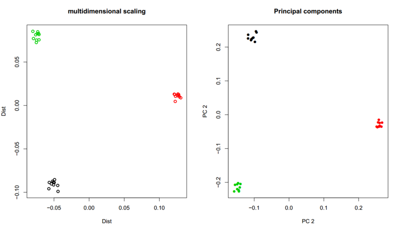
Multidimensional scaling (MDS)
Lets try to look at our estimate IBS matrix that was created from the first angsd command.
## Do in R
#read in the names of each individual
s<-strsplit(basename(scan("all.files",what="theFuck")),"\\.")
pop<-as.factor(sapply(s,function(x)x[5]))

#name of the ibsMatrix file
name <- "all.ibsMat"
m <- as.matrix(read.table(name))

#do the MDS analysis on the IBS matrix
mds <- cmdscale(as.dist(m))

#plot the results colored by population
plot(mds,lwd=2,ylab="Dist",xlab="Dist",main="multidimensional scaling",col=pop)
legend("center",levels(pop),fill=1:3)
If you cannot view the figure then you can find it here.
- Based on the plot which populations are the closest and which population is more distant?
- Does it make sense that the YRI population forms the most distant cluster?
Principal component analysis (PCA)
Similarly to the MDS analysis above, now try to do a PCA analysis based on the covariance matrix:
#in R
s<-strsplit(basename(scan("all.files",what="theFuck")),"\\.")
pop<-sapply(s,function(x)x[5])

name <- "all.covMat"
m <- as.matrix(read.table(name))

#get the eigen vectors
e <- eigen(m)

#plot the two first eigen vectors
plot(e$vectors[,1:2],lwd=2,ylab="PC 2",xlab="PC 2",main="Principal components",col=as.factor(pop),pch=16);legend("top",fill=1:3,levels(as.factor(pop)))
If you cannot view the figure then you can find it here
The plots are some what noisy. If you had used the whole genome it would have looked like this plot.
fastNGSadmix for PCA
We will try to use an genotype likelihood approach with admixture aware priors using fastNGSadmix
# NB this must be done every time you open a new terminal
AA=/home/wpsg/workshop_materials/05_angsd/PhDCourse

# Set path to ANGSD program
ANGSD=$AA/prog/angsd/angsd

# Set path to NGSadmix
NGSadmix=$AA/prog/angsd/mics/NGSadmix

# Set path to a bam file list with several bam files
BAMFOLDER=$AA/sfs/data/smallerbams/

# Set path for the fastNGSadmix program
fastNGSadmix=$AA/prog/fastNGSadmix/fastNGSadmix
fastNGSadmixPCA=$AA/prog/fastNGSadmix/R/fastNGSadmixPCA.R

# Set path for all input files you will use in this exercise
inputpath=$AA/admixture/data/fastNGSadmixinput/

## genotypes of reference panel
refGeno=$AA/prog/fastNGSadmix/data/humanOrigins_7worldPops


## PCAngsd
PCAngsd=$AA/prog/pcangsd/pcangsd.py
We will use the same reference panel as for the admixture analysis
| French | French individuals |
| Han | Chinese individuals |
| Chukchi | Siberian individuals |
| Karitiana | Native American individuals |
| Papuan | individuals from Papua New Guinea, Melanesia |
| Sindhi | individuals from India |
| YRI | Yoruba individuals from Nigeria |
.
And we will also use the same individual as last time namely the two karitiana individuals sample2 and sample3.
First rerun fastNGSadmix to get the admixture proportions, which we will use as admixture aware priors in the PCA analysis
# Analyse sample2
$fastNGSadmix -likes ${inputpath}/sample2.beagle.gz -fname ${inputpath}/refPanel.txt -Nname ${inputpath}/nInd.txt -outfiles sample2 -whichPops all

# Analyse sample3
$fastNGSadmix -likes ${inputpath}/sample3.beagle.gz -fname ${inputpath}/refPanel.txt -Nname ${inputpath}/nInd.txt -outfiles sample3 -whichPops all
Both qopt files should indicate that the sample is 100% Karitiana. We will add our sample to the genotypes of our reference panel can perform PCA using the genotype likelihoods and admixture aware priors for the NGS sample
First lets look a sample 2.
- How many sites did that sample have?
## The reference panels takes up too much ram (4Gb) in R. Therefore instead of running the below command you will just download the results
## Rscript $fastNGSadmixPCA -likes ${inputpath}/sample2.beagle.gz -qopt sample2.qopt -ref $refGeno -out sample2
## -likes: is the genotype likelihoods of the NGS sample
## -qopt: the estimate admixture proportions we will use as prior
## -geno: genotypes of the reference panel
## -out: output name (prefix)

## download the log file
wget http://popgen.dk/albrecht/phdcourse/run/sample2pca.log
cat sample2pca.log
- what information does the program spit out?
View the PCA plot in browser plot.
- Does the sample fall where you would expect?
Let’s try to see what the prior looks like.
I told you that you could use the results of admixture analysis to generate a PCA plot. This be done by removing all information from the NGS data. Let’s try to set all genotype likelihoods to 0.33:
zcat ${inputpath}/sample2.beagle.gz | sed 's/\(^.*\t.*\t.*\)\t.*\t.*\t.*$/\1\t0.33\t0.33\t0.33/g' | gzip -c > noInfo.beagle.gz
Try to view the new beagle file using for example zcat:
zcat noInfo.beagle.gz
Now let’s estimate the PCA based on the uninformative beagle file. This will show you where the prior will be placed in the PCA.
## The reference panels takes up too much ram (4Gb) in R. Therefore instead of running the below command you will just download the results
## Rscript $fastNGSadmixPCA -likes noInfo.beagle.gz -qopt sample2.qopt  -ref $refGeno -out noInfo
## download the log file
wget http://popgen.dk/albrecht/phdcourse/run/noInfopca.log
cat noInfopca.log
View the PCA plot in browser plot.
The non-informative prior was set to 0.33 for each genotype. If you set the value to something else than value 0.33
- Would the PCA change?
- Why/Why not?
When we use a prior we want to make sure that it does not dominate the results. We want our NGS data to add information. Lets look at the sample with ultra low depth called sample3.
– How many informative site with reads did this sample have?
The sample only has a single read at each informative sites out of a posible 442769 sites in the reference panel.
- What is the average depth of the sample?
Run the PCA for the low depth sample:
## The reference panels takes up too much ram (4Gb) in R. Therefore instead of running the below command you will just download the results
## Rscript $fastNGSadmixPCA -likes ${inputpath}/sample3.beagle.gz -qopt sample3.qopt  -ref $refGeno -out sample3
## download the log file
wget http://popgen.dk/albrecht/phdcourse/run/sample3pca.log
cat sample3pca.log
View the PCA plot in browser plot.
- Does this sample fall just as nicely as the other Karitiana sample?
- Does this fall in the same place as the prior?
admixture aware priors without estimate admixture proportions
Let’s try to perform a PCA analysis on the large 1000 genotype likelihoods that you performed admixture analysis on earlier.
First let’s set the path to the beagle genotype likelihood file
GL1000Genomes=$AA/admixture/data/input.gz

## copy population information file to current folder
cp $AA/admixture/data/pop.info .
- What were the populations included? And how many sites?
python $PCAngsd -beagle $GL1000Genomes -o input -n 100
The program estimates the covariance matrix that can then be used for PCA. Now look at the output from the program.
- How many significant PCA (see MAP test in output)?
Plot the results in R
#open R
pop<-read.table("pop.info")

C <- as.matrix(read.table("input.cov"))
 e <- eigen(C)
plot(e$vectors[,1:2],col=pop[,1],xlab="PC1",ylab="PC2")
legend("top",fill=1:5,levels(pop[,1]))
## close R
Compare with the estimate admixture proportions

- In the PCA plot can you identify the Mexicans with only European ancestry?
- What about the African American with East Asian ancestry?
- Based on the PCA would you have the same conclusion as the admixture proportions?
Try the same analysis but without estimating individual allele frequencies but using the average allele frequency. This is the same as using the first iteration of the algorithm
python $PCAngsd -beagle $GL1000Genomes -o input2 -iter 0 -n 100
Plot the results in R
#open R
pop<-read.table("pop.info")

C <- as.matrix(read.table("input2.cov"))
 e <- eigen(C)
plot(e$vectors[,1:2],col=pop[,1],xlab="PC1",ylab="PC2",main="joint allele frequency")
legend("top",fill=1:5,levels(pop[,1]))
## close R
- Do you see any difference?
- Would any of your conclusions change? (compared to the previous PCA plot )
Let try to use the PCA to infer admixture proportions based on the first 2 principal components. For the optimization we will use a small penalty on the admixture proportions (alpha).
python $PCAngsd -beagle $GL1000Genomes -o input -n 100 -admix -admix_alpha 50
Plot the results in R
#open R
pop<-read.table("pop.info",as.is=T)
q<-read.table("input.K3.a50.0.qopt")

## order according to population
ord<-order(pop[,1])
barplot(t(q)[,ord],col=2:10,space=0,border=NA,xlab="Individuals",ylab="Admixture proportions")
text(tapply(1:nrow(pop),pop[ord,1],mean),-0.05,unique(pop[ord,1]),xpd=T)
abline(v=cumsum(sapply(unique(pop[ord,1]),function(x){sum(pop[ord,1]==x)})),col=1,lwd=1.2)

## close R
- how does this compare to the NGSadmix analysis?
Inbreeding in the admixed individuals
Inbreeding in admixed samples is usually not possible to estimate using standard approaches.
Let's try to estimate the inbreeding coefficient of the samples using the individual allele frequencies
python $PCAngsd -beagle $GL1000Genomes -o IB -inbreed 2 -n 100
look in the file using
less IB.inbreed
The second colum is the inbreeding coeffient (allowing for negative)
- are any of the individuals inbreed?
- how do you interpret negative values?
- what do you think would have happend if we had not used individual allele frequencies?
PCangsd and selection
For very resent selection we can look within closely related individuals for example with in Europeans
## copy positions and sample information
cp $AA/PCangsd/data/eu1000g.sample.Info .

#get the number of individuals
#AA/PCangsd/data/eu1000g.small.beagle.gz
wc eu1000g.sample.Info
N=424 #one line for header
To save some RAM we will only use the first 100k sites.
zcat $AA/PCangsd/data/eu1000g.small.beagle.gz |head -n 100000 | gzip -c > eu1000g100k.small.beagle.gz
EU1000=eu1000g100k.small.beagle.gz
Run PCangsd to estimate the covariance matrix while jointly estimating the individuals allele frequencies
python $PCAngsd -beagle $EU1000 -o EUsmall -n $N -threads 2
Plot the results in R
## R
 cov <- as.matrix(read.table("EUsmall.cov"))

 e<-eigen(cov)
 ID<-read.table("eu1000g.sample.Info",head=T)
 plot(e$vectors[,1:2],col=ID$POP)

 legend("topleft",fill=1:4,levels(ID$POP))
- Does the plot look like you expected? (TSI=Tuscans from Italy; IBS=Iberian Population in Spain)
Since the European individuals in 1000G are not simple homogeneous disjoint populations it is hard to use PBS/FST or similar statistics to infer selection based on populating differences. However, PCA offers a good description of the differences between individuals which out having the define disjoint groups.
Now let try to use the PC to infer selection along the genome based on the PCA
python $PCAngsd -beagle $EU1000 -o EUsmall -n $N -selection 1 -sites_save
plot the results
## function for QQplot
qqchi<-function(x,...){
lambda<-round(median(x)/qchisq(0.5,1),2)
  qqplot(qchisq((1:length(x)-0.5)/(length(x)),1),x,ylab="Observed",xlab="Expected",...);abline(0,1,col=2,lwd=2)
legend("topleft",paste("lambda=",lambda))
}

### read in seleciton statistics (chi2 distributed)
s<-scan("EUsmall.selection.gz")
## make QQ plot to QC the test statistics
qqchi(s)

# convert test statistic to p-value
pval<-1-pchisq(s,1)

## read positions (hg38)
p<-read.table("EUsmall.sites",colC=c("factor","integer"),sep="_")

names(p)<-c("chr","pos")

## make manhattan plot
plot(-log10(pval),col=p$chr,xlab="Chromosomes",main="Manhattan plot")

## zoom into region
 w<-range(which(pval<1e-7)) + c(-100,100)
 keep<-w[1]:w[2]
 plot(p$pos[keep],-log10(pval[keep]),col=p$chr[keep],xlab="HG38 Position chr2")

## see the position of the most significant SNP
 p$pos[which.max(s)]
see if you can make sense of the top hit based on the genome.
- Look in UCSC browser
- Choose human GRCh38/hg38
- search for the position of the top hit and identify the genes at that loci