

Background
This exercise is designed to give a basic introduction to R by focusing on using base R functions as well as ggplot2 which is part of the TidyVerse suite developed by Hadley Wickham. ggplot2 is an extensive plotting library that enables the construction of a large number of plot types using a structured grammar.
The capabilities of R and ggplot2 go far beyond the time we have available within the Workshop. The goal of this set of exercises is primarily to get you familiar enough with the syntax and basic functionality of ggplot2. To this end, we have focused this material on a specific subset of R and ggplot2 functions.
If you would like to learn more about using ggplot2 there are extensive on-line resources, many of them linked here: http://ggplot2.tidyverse.org.
Exercise: Basic intro using the Iris data and plotting with ggplot
For our first example data set we will use classic Iris Flower Data Set generated by Ronald Fisher in 1936. It is included with the base R installation and is regularly used in introductory statistics courses as it has features that are easy to discriminate and plot. The data are made up of morphological measurements of a three types of flowers, the Iris setosa, Iris versicolor and Iris virginica.
Step 1: Set up a new RMarkdwon document
! NOTE: It may request that you install a new version of the markdown package. If it does, click on Yes.
We are going to run all of our analysis in RMarkdown code chunks. To initiate a new RMarkdown document use the dropdown file menus available in RStudio. First select the “File” menu. Within “File” hover over “New File” and select “R Markdown“.
A dialog box will open requesting some basic information about your analysis. For now just fill in the Title field with whatever you want to call your project and your name in the Author field. All other items can be ignored.
Once you click “OK” a new RMarkdown document with your title and name will appear in the upper-left window of RStudio.
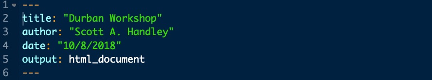
By default, a new RMarkdown document is populated with YAML text which includes basic document information, several example R chunks as well as explanatory text.
Your YAML file should look like this, but will include your name and title and a few other items. The YAML can be highly modified to customize document output. For more information see: https://rmarkdown.rstudio.com/markdown_document_format.
R chunks always begin with a “`{r title} and end with a “`. Anything in between will be run as a single piece of code (aka R chunk).
This is the first example R chunk:

Text is much simpler as it is just text. Anything not flanked with “`{r title} and a “` is just plain text. This is where you would keep notes, explain analysis, etc.
You can safely delete everything below the YAML file. These are just examples and can be removed so you can start with a fresh RMarkdown document. The only thing that should remain is the YAML file.
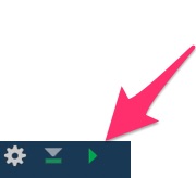
For every command below, you should embed it within an R chunk. To run a R chunk you select the play button in the upper right of the chunk:
From here forward you should write all of your analysis code within a single or multiple R chunks.
Step 2: Initiate your environment
For this exercise we will rely primarily on ggplot2 which is part of the tidyverse. By default this is not automatically loaded into R, so we need to do so before proceeding with our analysis.
Load tidyverse into your R session with your first chunk:

You should always name your chunks with a description of what that chunk does. Names should be simple, not include spaces or non-alphabetical characters and should be unique for each document. In other words, don’t name two R chunks the same thing, they always should be unique.
Once you have this R chunk code entered into your RMarkdown document you can click the play button in the upper right of the chunk to run it. You should see some information about the library as it loads in the Console in the lower-left panel of RStudio. You can ignore any warnings.
Step 3: Generate basic summary statistics for the iris data set
This command will provide you with summary statistics (min, max, means, 1st and 3rd quartile boundaries, etc.) about the iris data. The result should look like this:

In the lecture we spent some time discussing more advanced ways to manipulate and examine your data using dplyr. For example, enter the following code into an R chunk and run it:
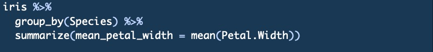
This will take the iris data and ‘pass’ it into the group_by() and summarize() functions of dplyr. The %>% is what passes of the data from one-step to the next. The %>% can be thought of as AND THEN”. So in your head this should read:
“Take the iris data set AND THEN group it by species AND THEN summarize the mean petal width for each species.”
If you entered everything correctly and ran your chunk with the code above then you should see the following in your console:
Questions:
- What is the mean petal length for versicolor flowers?
- What is the median sepal length for setosa flowers?
- Review the mutate() function of dplyr and create a new column of data with the Petal Length divided by the Petal Width
Step 4: ggplot2 plotting
ggplot2 uses a basic syntax framework (called a Grammar in ggplot2) for all plot types:
A basic ggplot2 plot consists of the following components:
-
- data in the form of a data frame
- aesthetics: How your data are represneted
- x, y, color, size, shape
- geometry: Geometries of the plotted objects
- points, lines, bars, etc.
- More … we won’t delve into this much here, but there are extensive geometries for a variety of other tasks such as setting the basic plot theme
The bolded and underlined portions in the list above are the actual commands you will enter into the console to build your plot (data, aes, geom). These are your basic building blocks for all ggplot2 plots.
Enter the command below and we will break it down after it has successfully run:
This should generate a plot that looks like this:
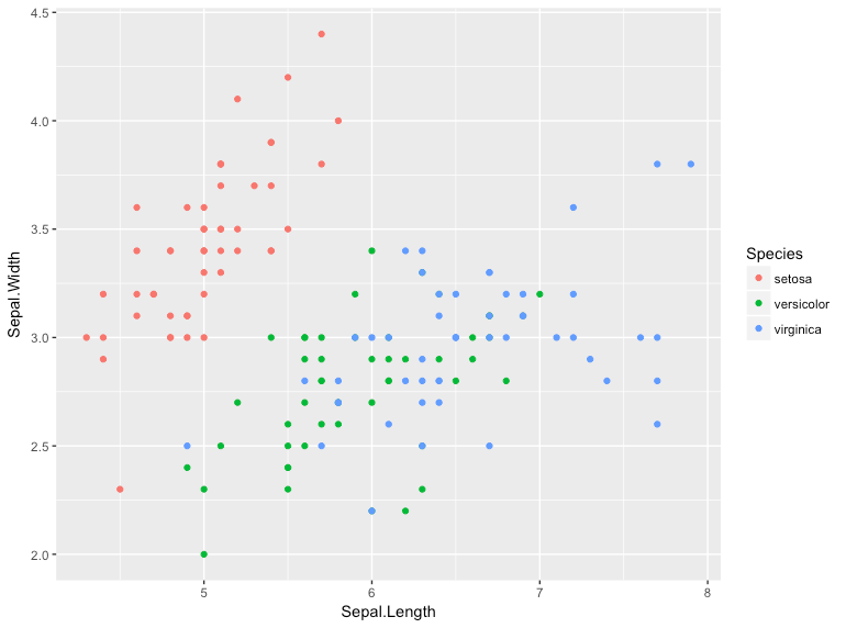
The plot displays a point (geom_point) for all of the data in the iris data frame. Sepal Width is plotted along the Y-axis (y=Sepal.Width), the Sepal Length along the x-axis (x=Sepal.Length). Each point is colored according to the flower species.
This is a minimal example of a ggplot code. All ggplot commands begin with ggplot, are followed with the entry of the data, then a basic description of how the data aesthetics using various aes (aesthetic) paramaters. After that, you add (+) the plot geometry using geom_point or another geom such as geom_bar, geom_line, geom_area. You can see a list all base ggplot2 geometries at: http://docs.ggplot2.org/current/.
There are a number of other interesting geometries that can be used such as one for network graphs (ggnetwork) or trees (ggtree).
To test your knowledge on implementing a basic ggplot2 command, try to draw a box plot of the iris data using species as the x-axis category and Petal Length as the y-axis category. The code is in the box below the plot, but try to generate it before looking!
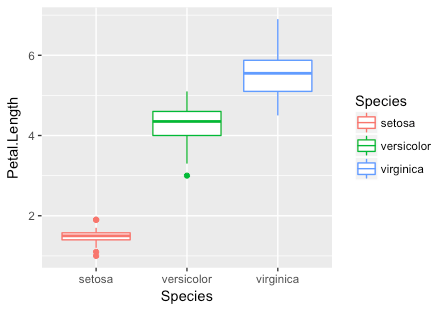
As you can see, the x-axis was defined by a categorical instead of a numeric variable.
Practice drawing the same plot with the aesthetic for y for:
- Sepal Width
- Sepal Length
Step 5: Modifying plots
In the previous examples we have left empty parenthesis () after specifying the geom (eg. geom_boxplot()). However, you can fill these parenthesis up with additional plotting specifications.
You can view all available parameters in R using the ? command (e.g. ?geom_boxplot for boxplots) or in the on-line documentation (http://docs.ggplot2.org/current/geom_boxplot.html).
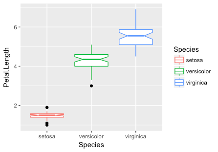
Let’s take advantage of this and update our boxplots to have notches and to display the outlier points in black instead of the category color. Attempt to generate the plot yourself using the information in the help or on-line documentation prior to viewing the code.
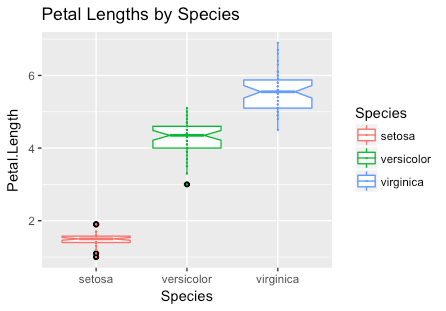
You can also add geometries together by separating them with a + symbol just as you added the first geometry.
Try to add a point geometry (geom_point) to the previous plot to display individual data for each boxplot.
Using these concepts, try to generate the following plot. Hint: use ggtitle to add the title.
At this stage you should have a basic understanding of the essential elements of a ggplot plot and how modifiers can be used to create new and interesting ways to display your data. There are a large number of built-in geometries and modifiers that can be used to get the result you want.
In addition, there is a community of developers who have created ggplot2 styled libraries. So if you want a geometry that doesn’t exist in base ggplot2 you should search for a library that may have what you want. The official ggplot2 extension library has a large number of new geometries which you can install (http://www.ggplot2-exts.org/gallery/). In addition, there are well developed libraries like PhyloSeq which heavily leverage ggplot2.
Step 6: Faceting plots
A powerful feature of ggplot is it’s ability to ‘facet‘ data by categorical variable. There are a number of ways to do this. The simplest way to explain this is by example:

The facet_grid command instructed ggplot2 to divide, or facet, the data across the categories defined in Species.
facet_wrap is a variation of facet_grid which permits a bit more customization. Use facet_wrap in place of facet_grid and specify the number of rows to 3 to recreate the above plot from a horizontal 1×3 panel to a vertical 3×1 panel. Hint: review the facet_wrap help page or use tab completion to identify the modifier for number of rows and number of columns.
Step 7: Saving and displaying plots
The above examples just pushed the plots to the standard graphics viewer available in RStudio. If you want to save a plot you can do so be redirecting it into a new object in R.
For example, to save the first plot you drew you could save it to an object called plot1 with the following code:
A new R object will be added to your environment. You can call this object and display it by just typing the name of the object (plot1).
Save ggplot2 objects can be directly modified. So instead of rewriting the code to add a title to the plot you can just ? ggtitle(“Plot Title”) using the following syntax
Once you have a plot just how you like it, you can export it as a PNG, JPEG, TIFF, BMP, SVG or EPS using the dropdown menu labelled export in the plotting window.
Step 8: Interactive plots with plotly
R has the ability to generate interactive ggplot2 formatted plots through specialized libraries. One of the more friendly libraries for generating interactive plots is plotly which is made freely available through the company plotly.
In order to work with plotly you will need to install the plotly R package:
Let’s turn the last plot into an interactive plot. To do this, the first thing you need to do is save the plot as an object in your environment.
To do this, modify the R chunk you used to generate the last plot to redirect the plot into a new object called ‘p’:
Your plot is now saved in an object called p. You can now use the plotly library to make generate an interactive plot. First you will need to load the plotly library into your R session.
After this, you can just feed your plot (p) into a command called ggplotly:
It may take a few moments, but ultimately a plot will appear in the Viewer tab in the lower right window of RStudio. You can mouse over the plot and explore how it is now interactive.
Step 9: Examples on your own
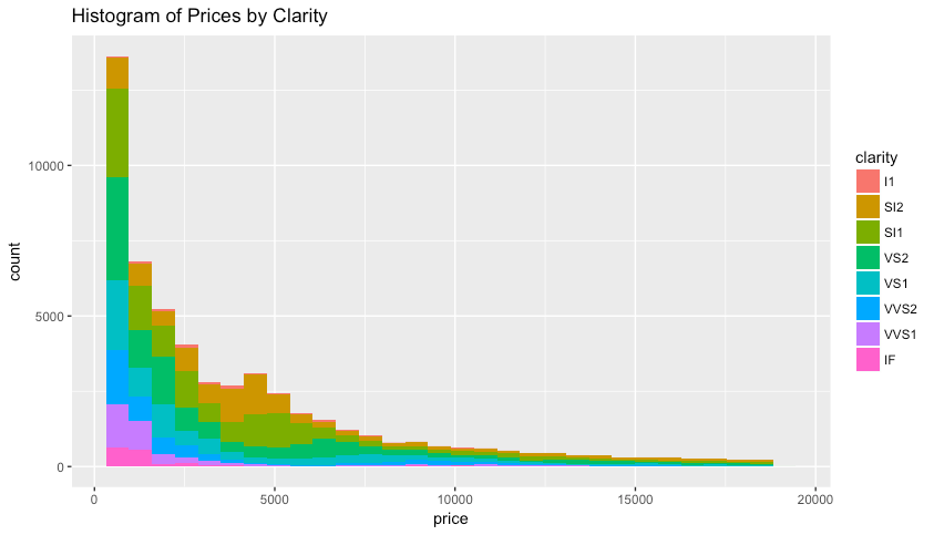
Using the concepts learned above, work on your own to reproduce the following plots using the diamonds data set which included with the ggplot2 library. The data contain the prices and other attributes of almost 54,000 diamonds.
NOTE! The colors may not be exactly the same depending on the version of R being used.
Plot #1: Faceted scatterplot

Plot #2: Colored Histogram
Step 10: knit your RMarkdown work into a HTML document
That’s it! You now have a digital lab notebook with editable R commands that you use for your analysis. It is highly recommended that you keep all of your R code within code chunks. It will save you a tremendous amount of time when it comes to parameterizing your plot.
There is much more to learn about RMarkdown documents and how they can be used for analysis sharing and automated report generation. If you would like to learn more you can read through the full RMarkdown documentation at: http://rmarkdown.rstudio.com.