!!! RStudio seems to crash in the cloud very often. So, we highly recommend you to save the R session as often as you would like to as you go along with this exercise.
If you are starting ggplot directly without the R introduction exercise, you need to read-in the files to make R-objects as explained in the R introductory exercise!!
ggplot2 exercise: Using the package ‘ggplot2’ for creating graphs.
ggplot2 is a popular package for plotting various graphs in R. You will try out a few basic ggplot2 commands in the following exercises. This package, created by Dr Hadley Wickham, offers a powerful graphics language for creating both simple and complex plots. The ggplot2 homepage can be found here: http://docs.ggplot2.org/current/
You can now load this package into your R session like before:
library("ggplot2")
ggplot2 requires data in a “long” format. In order to transform our data to this format, we can use the function melt in the package reshape2. This adds metadata, which makes it easier for ggplot to utilize multiple layers of factors when visualising the data.
Before melting the data we need to combine the data tables and metadata for both healthy and sick together! We will use rbind (row-bind) and cbind (column-bind) functions in R.
gg1 <- cbind(healthy,healthy_metadata)gg2 <- cbind(sick,sick_metadata)gg_mat <- rbind(gg1,gg2)
We now have measurements from 21 healthy patients and 7 sick patients in this data table as rows, with 79 variables as columns. You can check this using the function dim. Now, we will also add an extra column in order to give an ID number to all the samples.
gg_mat[80] <- c(paste("H", 1:21, sep=""), paste("S", 1:7, sep=""))colnames(gg_mat)[80] <- "ID"
Now we have our data frame ready and we can use the melt function.
library("reshape2")gg_melt <- melt(gg_mat, id.vars = c("ID","Age","Diagnosis","Sex"))
You can check how this format looks like using the head function.
[toggle hide=”yes” border=”yes” style=”white”]head(gg_melt)
  ID Age Diagnosis Sex variable value
1 H1 55 Healthy M Listeria_phage_LP.125 0
2 H2 57 Healthy M Listeria_phage_LP.125 0
3 H3 32 Healthy F Listeria_phage_LP.125 0
4 H4 37 Healthy M Listeria_phage_LP.125 0
5 H5 52 Healthy M Listeria_phage_LP.125 0
6 H6 56 Healthy F Listeria_phage_LP.125 0
[/toggle]
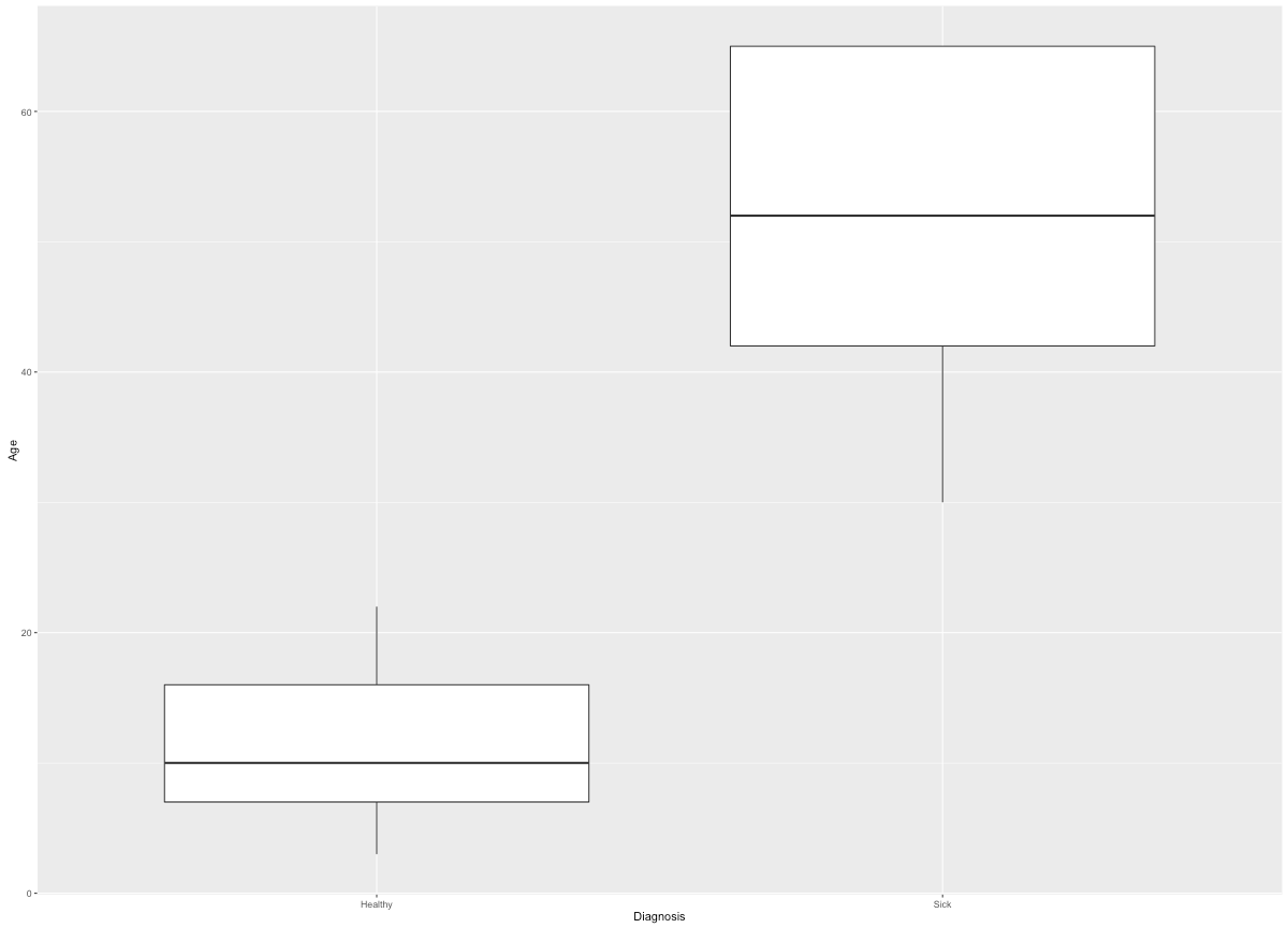
Now, you can start with plotting the same boxplot we did in the earlier basic plotting exercise, but this time you will do it using ggplot. We can get the following plot using the following command:
[toggle hide=”yes” border=”yes” style=”white”]ggplot(gg_melt, aes(x=Diagnosis, y=Age)) + geom_boxplot()
 [/toggle]
What we did was to start with the basic function ggplot, define x and y inside aesthetics, and then added how we wanted to plot the data after the ‘+ sign’. Some aesthetics that plots use are:
- x position
- y position
- size of elements
- shape of elements
- color of elements
The elements in a plot are geometric shapes, like
- points
- lines
- line segments
- bars
- text
You can change the axis titles, their labels, text sizes and colors using theme as an addition (+) to your plot data like this:
ggplot(gg_melt, aes(x=Diagnosis, y=Age)) + geom_boxplot() + theme(axis.title.y = element_text(colour="grey20",size=20),axis.text.x = element_text(colour="grey20",size=20),axis.title.x = element_text(colour="grey20",size=20),axis.text.y = element_text(colour="grey20",size=20))
It is also possible to make custom boxplots with special features such as a ‘notch’ and with colors.  [toggle hide=”yes” border=”yes” style=”white”]
[/toggle]ggplot(gg_melt, aes(x=Diagnosis, y=Age)) + geom_boxplot(notch = TRUE, fill = "grey80", colour = "#3366FF")+theme(axis.title.y = element_text(colour="grey20",size=20),axis.text.x = element_text(colour="grey20",size=20),axis.title.x = element_text(colour="grey20",size=20),axis.text.y = element_text(colour="grey20",size=20))
You can also make “violin” plots which are similar to box plots!
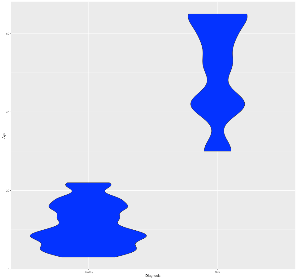
[/toggle]ggplot(gg_melt, aes(x=Diagnosis, y=Age)) + geom_violin(fill="blue")
You can make box plots/violin plots that subset the data into factors such as sex using the syntax similar to the following:
ggplot(gg_melt, aes(x=Diagnosis, y=Age)) + geom_violin(aes(fill = factor(Sex)))
[toggle hide=”yes” border=”yes” style=”white”]
 [/toggle]
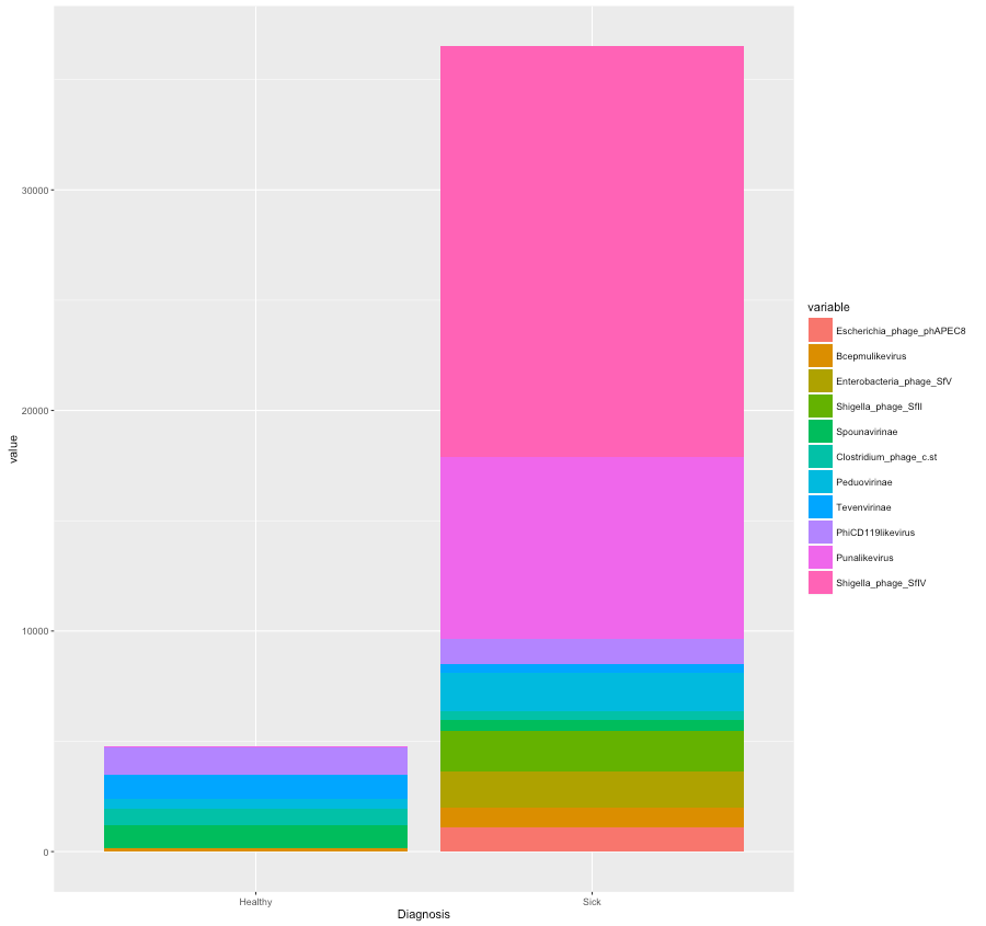
Now, we will create stacked bar plots. We don’t want to plot all 76 microbes in this dataset so we’ll only use the most abundant ones. To do this we will create a subset of our original dataset of the microbes that are represented more than 1000 times.
[toggle hide=”yes” border=”yes” style=”white”][/toggle]gg_vir <- gg_mat[,c(1:76)]gg_sub <- gg_vir[,colSums(gg_vir) > 1000]gg_subset <- cbind(gg_sub, gg_mat[,77:80])
This data need to be melted as well before we can use it in the ggplot
sub_melt <- melt(gg_subset,id.vars = c("ID","Age","Diagnosis","Sex"))
Stacked bars could be obtained by using the syntax similar to the one below:
[toggle hide=”yes” border=”yes” style=”white”]ggplot(sub_melt, aes(x=ID,y = value,fill=variable)) + geom_bar(stat='identity')
 [/toggle]
A similar plot with a cumulative healthy and sick data can be done as follows:
[toggle hide=”yes” border=”yes” style=”white”]ggplot(sub_melt, aes(x=Diagnosis,y = value,fill=variable)) + geom_bar(stat='identity')

[/toggle]
Now you’ve completed the introduction to ggplot2, good job!! 🙂 A very nice cheat sheet summarising different ggplot2 commands can be found here!